 thefrontendteam.com
Design, UX, and Mockups for Frontend Developers - The Definitive Guide in 2022
Build a mockup using Figma and learn the basic rules of design and UX - for frontend developers
This book is part of the Definitive Frontend Guides series at thefrontendteam.com/books
Table of Contents
Chapter 1: Basic Guide to Creating a Mockup and a Prototype of a Web Application Within a Few Hours
-
Step 1: Inspiration
-
Step 2: Creating a Sketch
-
Step 3: The Mockup
-
Step 4: Techniques Used to Create a Mockup
Chapter 2: The Most Important Web Design Techniques for a Frontend Developer
-
Contrast
-
Repetition
-
Alignment
-
Proximity
-
Fonts and Design
-
Colors: Palettes, Combinations and Some Developer Tools
-
Icons: Styles, Creation Bases and the Best Sites to Find Uniform Icons
Chapter 3: User Experience for Frontend Developers
-
Step 1: Give Value With the UX
-
Step 2: Iteratively Create Simplicity, Speed, and Completeness
-
Step 3: Fun and Aesthetics
-
Step 4: Iterative UX Process
-
Verifying the UX of the Created Product
-
Evaluating the UX of a Web Project: User Session, Videos, and Heatmaps
Chapter 4: How to create the mockup of a landing page step-by-step
-
How to design the texts for an effective landing page: Information UX for an LP
-
Build a Landing Page in Figma: How to Create a Mockup
Before we start
We developers are people who always strive to understand problems and try to solve them together with our team.
In my experience as a frontend developer, I've noticed that frontend developers often don't know the language of designers and user experience (UX) experts, which makes it difficult to communicate. As a result, there are often misunderstandings, and projects do not develop as expected.
There is also a false tendency to think that designers/UXs and developers live in different worlds.
However, I can assure you that a developer can easily learn the basic concepts, which are simple to learn and easy to apply.
Once learned, these concepts will allow us to better understand some design and UX choices, with the result that each project will be perfectly balanced in terms of design, UX and development.
I wrote this book because I want increasing numbers of developers to enter the world of design and UX, and to know just the basics (not to replace designers, God forbid---to each his or her own work).
The aim, in fact, is quite the contrary: it is to make the collaboration between frontend teams more effective and efficient, so that the end user can achieve the maximum benefit from the final product.
In this book, you will learn:
-
How to easily create a mockup in Figma that is graphically similar to the final app;
-
How to create a mockup that is beautiful to look at, easy to use, and well crafted;
-
What needs to be done to give a better UX to the end user of a product.
About me, the author, I have worked in frontend development for several years now. I have already written two books (one about Angular, and one about Design Patterns in TypeScript), and there's always more to learn.
If you:
-
want to know more about me,
-
have any questions/feedback about the book,
-
or just want to talk about frontend development,
then get in touch on LinkedIn at linkedin.com/in/salvatoreromeo.
Now let's start to enjoy learning the design/UX concepts that will change you as a frontend developer forever.
A small note: you can find updates about this book in a dedicated page at https://thefrontendteam.com
If you have any feedback about the book, then contact me directly at [email protected].
Chapter 1: Basic Guide to Creating a Mockup and a Prototype of a Web Application Within a Few Hours
When we need to create a new front-end project, the worst thing we can do is to develop the code right away. There are three mistakes that are very common:
-
The project does not correspond to what the customer wanted;
-
The project is not usable;
-
The project is not aesthetically beautiful.
To overcome all of these problems, it is useful to create a mockup consisting of the graphics of the app, which can be shown to the various interested parties before even a line of code is written.
Even if you are not a designer, creating a mockup is something everyone can do, including frontend developers.
Introduction
In this chapter, we will introduce the techniques and practical tools needed to create a mockup, while in the following chapters, we will understand how to create an excellent application in terms of the user experience and design.
Mockup: How to Create One Within a Few Hours and Make It Interactive
How much time and which tools and techniques are needed to create a new web project?
The image above shows a web app, or rather something that will be a web application. In fact, not a single line of code has yet been written.
The first step towards generating clear ideas about a product and creating excellence in terms of quality is to move the product out of one's mind into the form of actual images.
In this way, we can actually share what is still only in our head.
Images showing how the web or mobile application will look are called mockups. These have many advantages, for example:
-
They are quick to create;
-
They are very similar to the graphics of the final product;
-
They allow the design and development team to fully understand what needs to be done;
-
Since they can be rendered in an interactive form, when we show them to the end user, we can gather UX and design feedback within a very short time.
In my opinion, the feedback received from the user at this stage is of the highest possible value: based on this feedback, we can create a new version of the mockup that better meets the needs of the end user, without high times and costs, compared to actual development.
Although asking a designer to create a mockup is the obvious choice, this is often not possible. I think it is important even for non-designers to have a basic knowledge of how to create a mockup.
For frontend developers, how complicated is the process of making a mockup?
In this first chapter, we will introduce the techniques and tools used to create a mockup, while in the next sections, we will explore how to develop a mockup by maximizing the design and UX.
Step 1: Inspiration
Even experienced designers need to be inspired to create their designs. For developers, taking inspiration from external work of other designers can help a great deal.
To examine mockups for existing projects, I recommend searching the following websites.
Dribbble
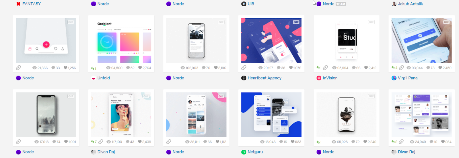
Although Dribbble is a generic website for designers, searching with queries such as "mobile app", "mobile mockup", "web" or "dashboard" returns an enormous number of very elegant designs.
For example, look at https://dribbble.com/search?q=Mobile+app.
ThemeForest
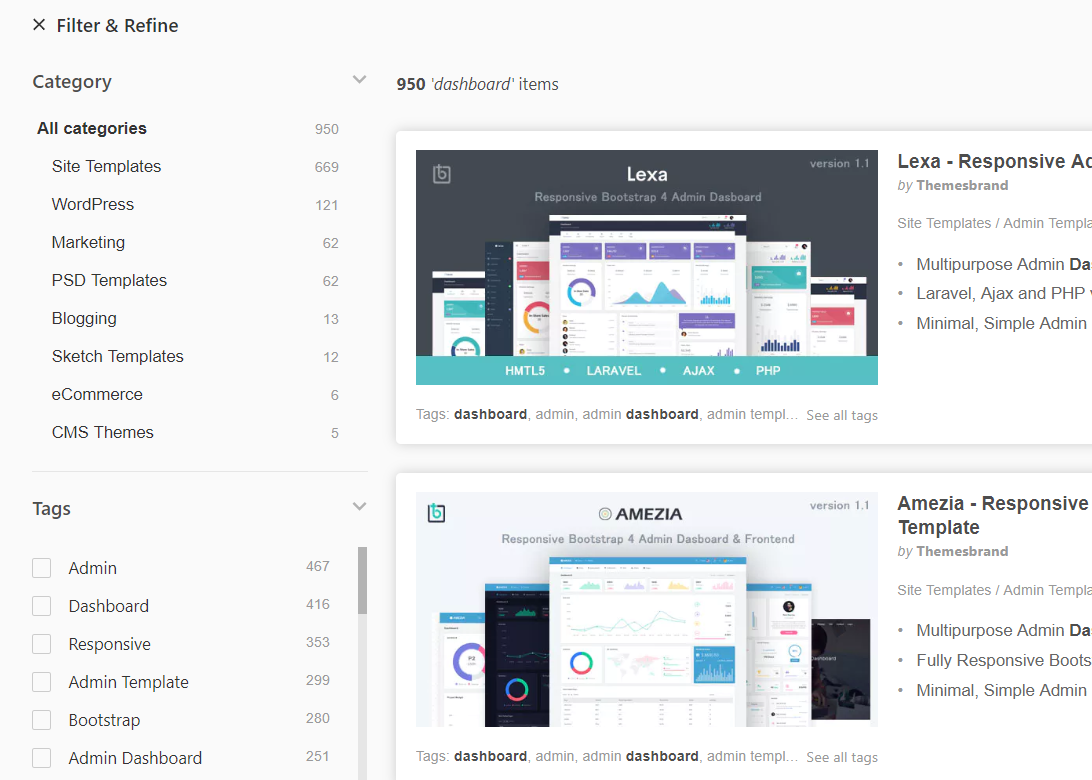
ThemeForest is dedicated exclusively to selling templates. Some templates are really well done, and can be useful in terms of inspiring the creation of a new project, for example https://themeforest.net/.
Step 2: Creating a Sketch
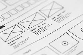
Before creating a detailed mockup, we need to have a clear idea of what we want to achieve.
Even though creating a mockup is a quick operation, creating a sketch of an application with pen and paper is even faster.
At this stage, I recommend a simple trick: don't to be precise, but try to create an initial version that shows the most useful features for the end user.
After correcting the first draft a few times, we can move on to the mockup.
Tip: It's more effective to iterate these drafts with the help of another person.
Step 3: The Mockup
At this point, we are ready to create the mockup. In this step, we will summarize the techniques that can be used to make a mockup, and in the following step, we will introduce some software tools for generating a mockup quickly and effectively.
Which techniques are needed to create a mockup?
We can create mockups at various levels of detail. If we want to be pixel perfect, then we can use vector graphics software such as Figma (web), Sketch (Mac only) or Inkscape (free, portable and multiplatform).
To create a mockup with standard components, we can use software with ready-made component libraries based on drag and drop, which allow for the creation of pages with buttons and images in a very short time (e.g. Mockups or Figma).
Personally, I prefer the vector graphic software: after a little practice, the developer can achieve anything that can be imagined.
Moreover, there are now numerous ready-made component libraries called design systems for software such as Figma, which let you still use drag and drop to quickly create GUIs and so have the best of both worlds: a vector graphic software with ready-made components.
At https://thefrontendteam.com, we have several articles describing what a design system is and how to create one on your own.
Since Figma is useful in both cases and is free, we will use this tool in the examples below.
Note that in the following section, we explain the techniques involved, rather than just how to use Figma. You can use these techniques with any software.
Getting Started with Figma
Before we begin, let's get acquainted with Figma.
-
Go to the site https://www.figma.com, and sign up;
-
Immediately after signup, you will see a screen similar to the one below:
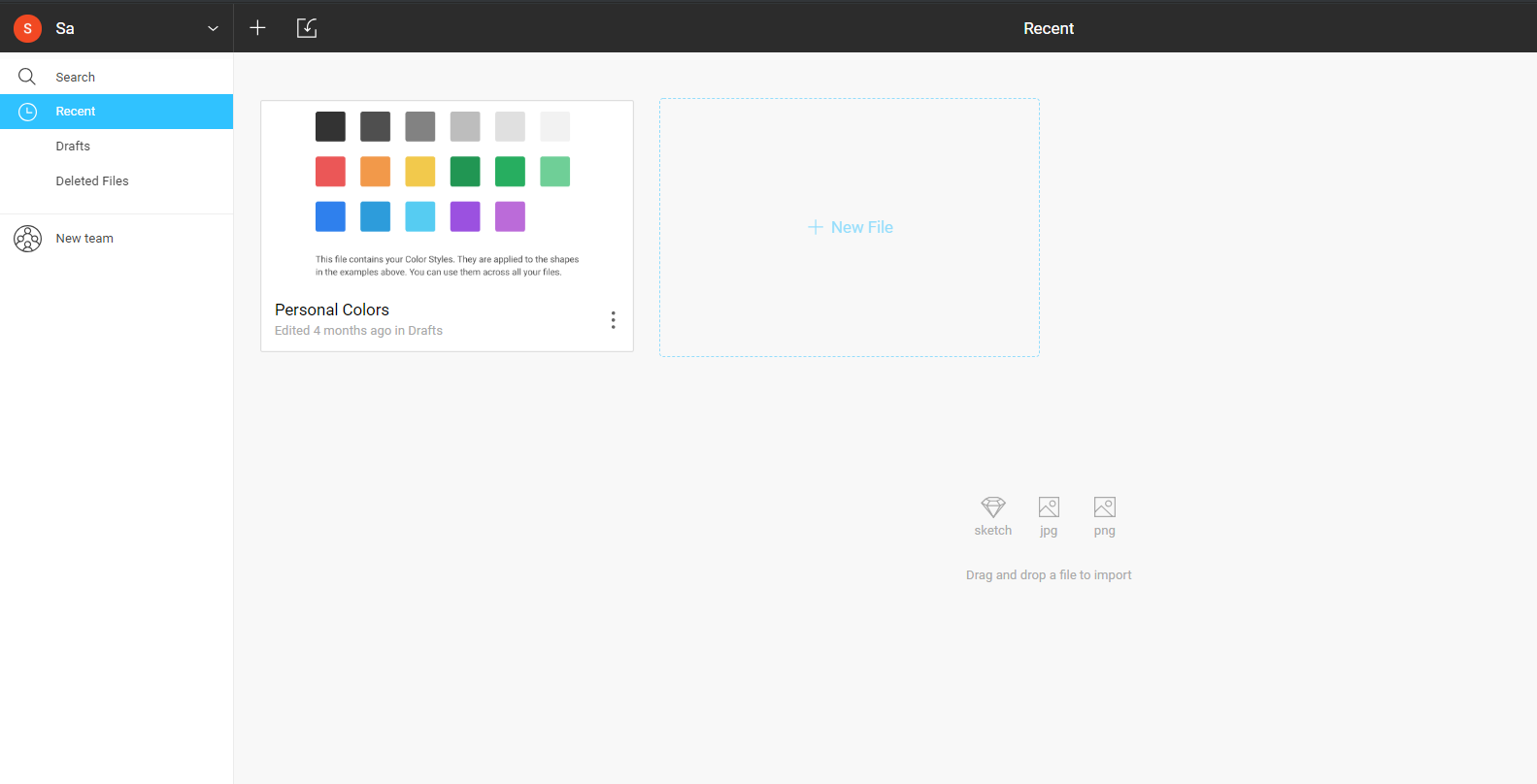
- After confirming your email, you will see some example projects, such as those illustrated below.
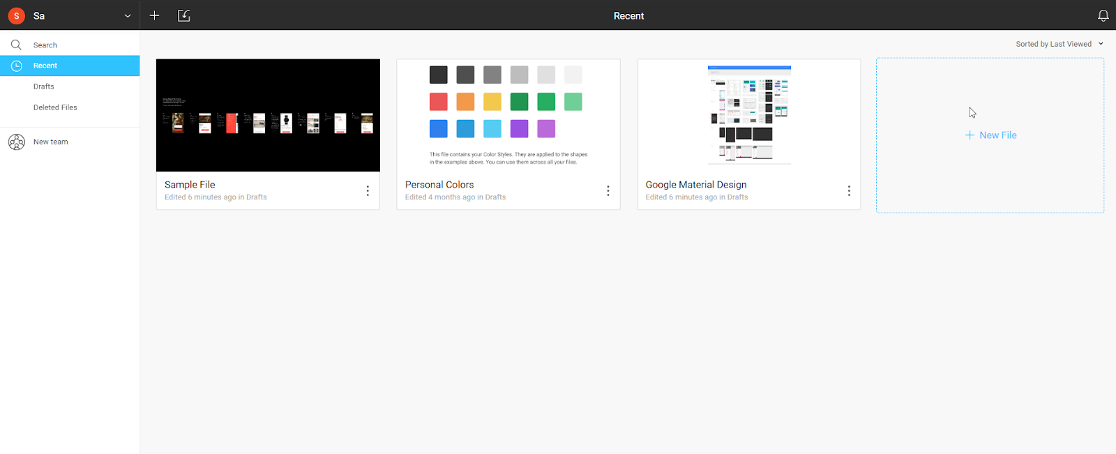
To become familiar with this tool, open some of the listed files and start to experiment.
We will learn the basics in the following section.
Step 4: Techniques Used to Create a Mockup
To create a mockup, regardless of the software that will be used, we need to learn some simple techniques, such as:
-
Navigation, i.e., how to move around the canvas;
-
Rectangles and rounding, which are used to create the shapes and structures that will form the components of the application;
-
Straight lines, which will be used as separators and enclosures to create more complex shapes;
-
Images and icons, which can be used to characterize our application;
-
Groups, which will allow you to move and resize sets of simple shapes as if they were a single object;
-
Alignment, which is used to create a clean, elegant design;
-
Interactivity, which allows the user to evaluate their experience of the application as if it were the real thing; this is especially useful in the presence of customers/end users.
We will review these tools for the general case, and will illustrate how to use them with Figma software in particular.
Navigation

The first thing that you need to learn is how to navigate around the canvas. The canvas is infinite, so you can add lots of pages. You can move left/right or up/down, and zoom in and out.
To navigate around a project, use the mouse wheel:
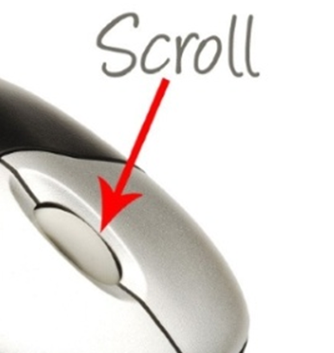
-
Use scrolling to move the canvas vertically in the same way as a web page;
-
Press SHIFT to scroll horizontally;
-
Press CTRL to control the zoom, which is useful for moving quickly to distant parts of the canvas.
Try these and experiment a bit. These are the functions you will use most often in everyday work.
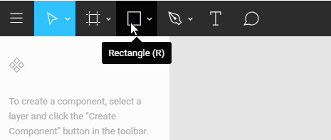
Rectangles and Rounding
When creating a mockup, you will need to create a graphic structure. The most common objects used in a mockup are rectangles. We will use these both directly as pieces of the application and also as graphic components to create more complex objects.
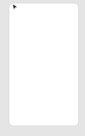
When creating a mobile application, I always like to have a reference, so I always make a skeleton of a mobile phone as follows:
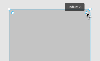
- Select the rectangle tool in the top left corner:
- Add some rounded edges using the circle in the top right corner of the rectangle you have just drawn.
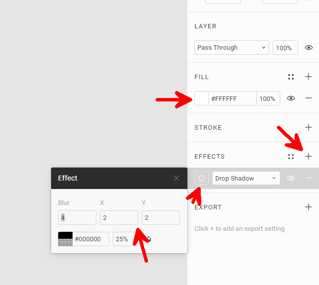
- Let's change the background to white and add a shadow using the bar on the right, as shown below:
Rectangles and rounded rectangles form the basis for the graphic structures used in any desktop or mobile application.
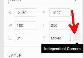
As a final note, we can change the rounding of each corner separately using the properties shown in the button on the right:
Lines
Another requirement when creating mockups is to separate the different parts of the application. In some cases, using space is adequate, but sometimes you need lines.
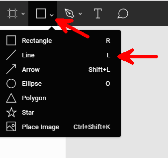
To create a line, click and hold down the rectangle button to open the menu:
As an example, we will draw a line to highlight the status bar of the phone:
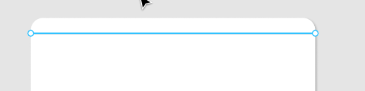
In any vector graphics tool, you can force a horizontal direction of the line. In Figma, you will get a straight line by holding down the SHIFT key while drawing the line.
We can change the curvature of the line or add points to break the line using the tools in the top left corner (which become visible when you click on the line):
Most of the time, you will only need to use vertical and horizontal lines, but it is also useful to know that Bezel curves exist.
Importing Images and Icons
The aim of the mockup is to resemble the final app. The more realistic it appears, the better the feedback you will get from stakeholders.
Images and icons can bring to life a mockup that otherwise would seem artificial. In Figma, we can use copy/paste from any application and find the copied image by pressing CTRL + V directly in the browser. Figma also supports SVG icons*.*
On the website http://iconmonstr.com, you will find many icons in SVG format. You just need to copy the code to make them available as a vector on the Figma app.
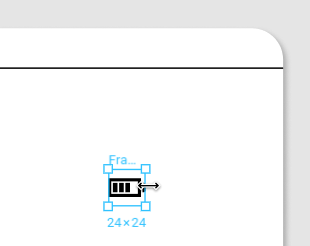
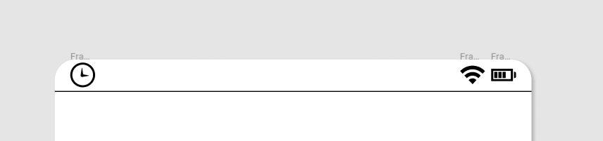
For example, we can complete the image of the mobile phone by including icons for the battery, WiFi and clock:
- Search for "battery" and click on any icon of a battery. Then click at the bottom on "I agree ..." and "Embed";
- Select all the SVG code and paste it directly into Figma to see the icon, as shown below:
- We can proceed in the same way for the other icons, and obtain the complete bar as shown below:
SVG icons are very powerful because you can scale them without losing detail. Moreover, you can change the color of an icon directly from the app. Sometimes you will need to slightly modify an icon, and SVG allows for easy modification of the shape: double-click the icon and play around with the icon shape (also called path) by dragging the borders.
What about images?
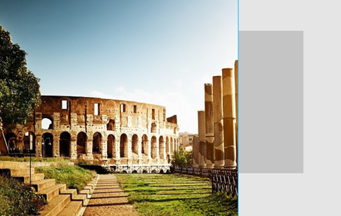
You can also paste images. These can be copied from any web page, and pasted into Figma. But you should check the copyright. One good place to find images is unsplash.com.
When pasting an image, you usually want to use only part of it. To achieve this, we can take advantage of masks, which are objects that can be placed under an image to hide everything except the part the image that is over the object. Figma chooses to mask with the object UNDER the image, while other apps offer masking by using objects OVER the image. Personally, I prefer the latter :-)
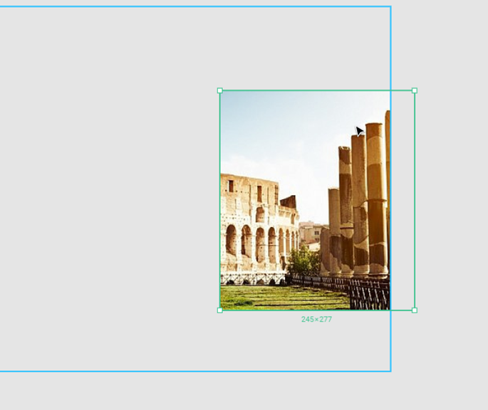
The steps needed to create a mask are as follows:
-
Create a rectangle (or any other shape) over an image;
-
Right click on the image and select "Bring to top";
-
Now select both the image and the rectangle (by using the SHIFT key or by selecting them from the list in the left menu);
-
Right click and select "Use as mask".
The image above shows the result (when you deselect, only the masked image will be visible, without the borders). To edit the mask, double click on the masked image.
Groups
In a mockup, some parts of the application are often similar to others. You don't need to re-draw each part every time; instead, you can create graphic components and reuse them as needed. In Figma, the concept of components is built into the app, but all mockup software (including Figma) offers the more general concept of groups.
Groups can be thought of as containers for graphic components (or graphic objects). You can also create groups of groups ( :-o ).
To create new groups, select multiple objects, and then right click > Group Selection.
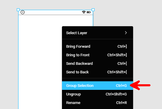
A group can be moved and resized as a whole. The result is that the elements within the group are scaled and moved proportionally. To resize a group, just press the k key and then drag the small squares positioned around the group.
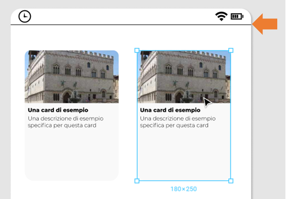
A group is also useful because we can duplicate it with CTRL + D to obtain a new, identical object that is ready to edit.
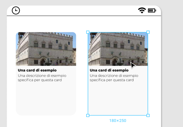
In the final mockup of the application shown at the beginning of this chapter, I duplicated the card several times and then modified only the image and the text inside, as shown below.
To create the mockup above, I used only the techniques introduced so far in this chapter: rectangles, images, icons and groups.
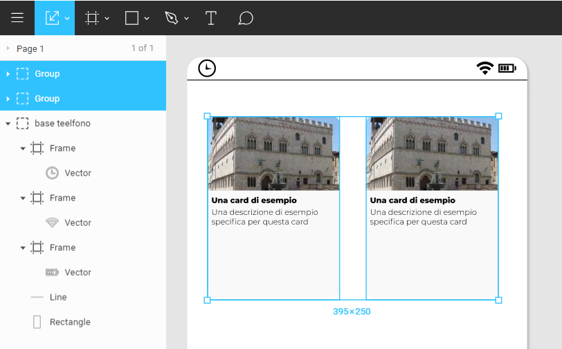
As a final note, you can select a group or an object within it by double clicking. Alternatively, you can use the menu on the left side, which makes visualization of the group structure easier, as shown below.
Alignment
A mockup is pleasing if it has some degree of order and a clean appearance.
When creating a mockup, it is good practice to respect some basic design rules. We will see in the next chapter what these rules are for a front-end developer, but in the meantime, we can see that alignment plays a fundamental role.
The application itself always offers guides that can be used to align objects with respect to other objects or the center of the canvas. If you look at the sidebar, you will see that there are also some buttons for aligning groups of objects at the top, bottom or center and for distributing them horizontally or vertically, as shown below.
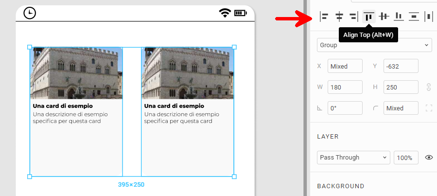
We'll see later how much difference there is between a non-aligned mockup and an aligned one. For now, we will simply note that alignment can be easily achieved as illustrated above.
Exporting
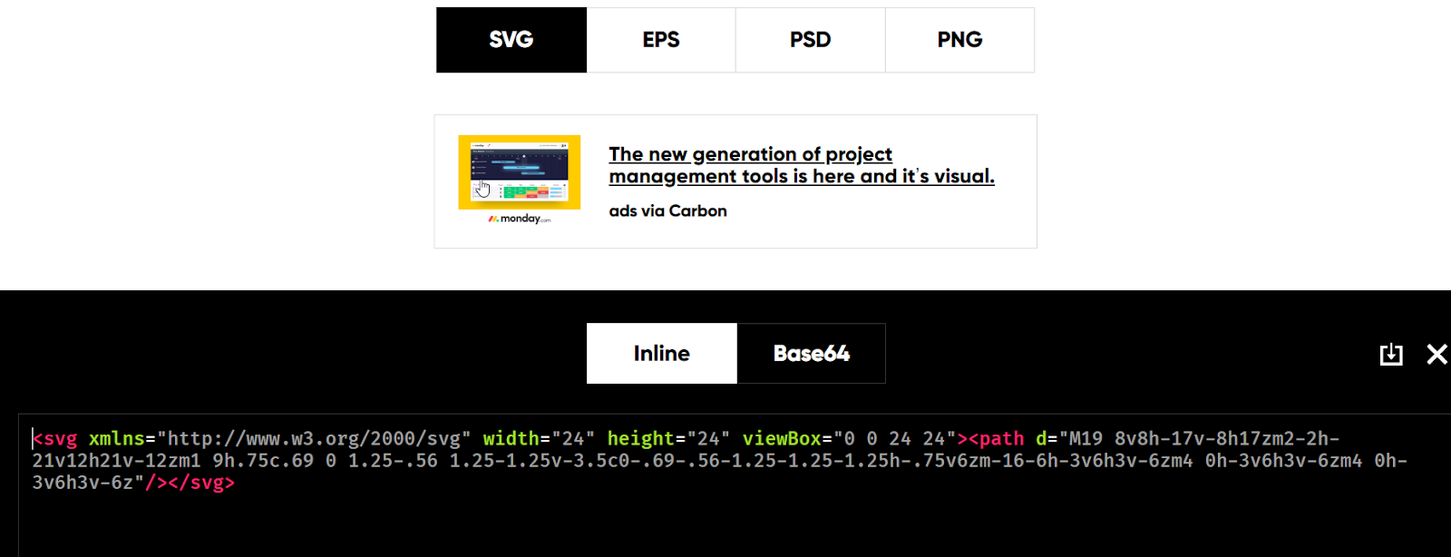
The time has come to export our project. To do this, we first create a group, and in the right sidebar, click on the + symbol next to Export:
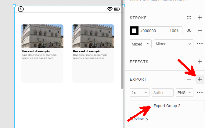
We can then choose which format to export to (PNG, SVG, etc.).
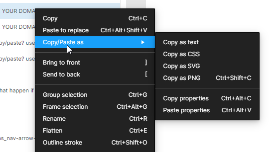
Another way to export part of the graphic is to use the left sidebar: you can right-click on any element and choose Copy as SVG, Copy as PNG, and so on. You can then paste it into your application as shown below.
Interactivity
After having created several pages for our application, it would be nice to give life to our project by allowing the user to click on one page to go to the next, almost as if the application was real.
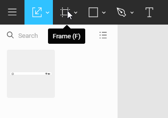
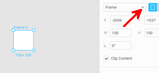
In Figma, there is a particular type of group called a frame, which can be used to make an application interactive.
To add a frame, click on Frame at the top left, as shown below:
From the properties on the right, we can change the dimensions of the frame to match those of a real device.
Below, you can see the result for a frame for an iPhone 8:
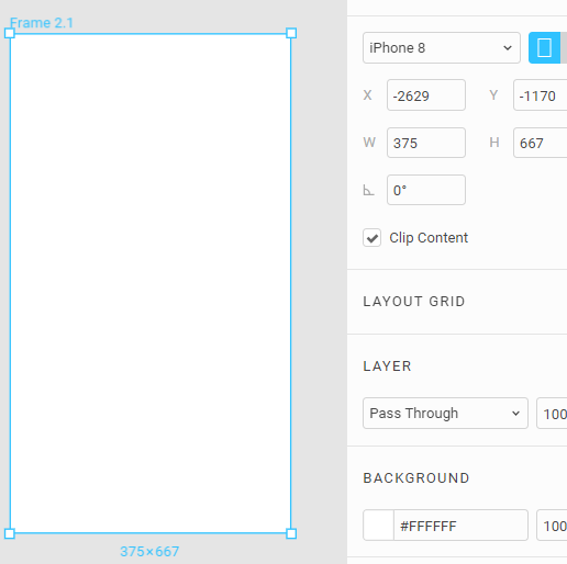
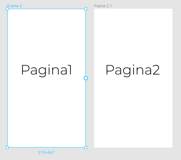
We can add to the frame all the objects that represent one page of our application.
In the following, we illustrate how to create two frames.
From the right bar, we can choose the Prototype tab to add an action: when the user clicks on a frame, the next one is displayed. This is illustrated in the image below.
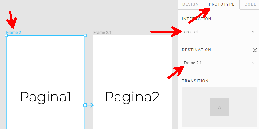
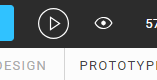
To try our live mockup, we can press the Play button in the top right corner:
Well done!

In this chapter, we have seen what a mockup is and how it can help us visualize a new application even before it is developed.
We have also learned that only a few techniques are needed to create mockups, and these are easy to learn and apply (creating rectangles, pasting images and icons,...). Figma is an online app that can be used to create mockups using these techniques.
As discussed in the introduction, knowing how to create a mockup is just the first step: the aim is not just to create a mockup, but one that is beautiful and usable.
In the next chapter, we will explore the basics of UX and design that a developer must know in order to create an aesthetically pleasing and above all very usable mockup.
Chapter 2: The Most Important Web Design Techniques for a Frontend Developer
How complicated can designing a web project be? How do you design a mobile application? Are there any design techniques that even a frontend developer can learn and apply? And how complicated are these techniques?
Developers often have no design skills, perhaps because they believe that these are inborn and cannot be learned.
In fact, the basic rules are simple, can be easily learned and can always be applied to a sketch or a mockup.
In this chapter, we will introduce the CRAP techniques (contrast, repetition, alignment, proximity) and give some hints on fonts, colors and icons. More importantly, we will contextualize these techniques to frontend development.
Introduction
In the previous chapter, we learned how to create a mockup with software tools. However, it is also necessary to know how to use these tools in the best possible way, especially from an aesthetic point of view.
In this chapter, you will learn how to make a web project elegant and aesthetically beautiful.
The basics that we will introduce here actually apply to every graphics project; however, we will discuss them from the point of view of frontend developers, who often tend to create designs that are too bold.
CRAP (Contrast, Repetition, Alignment and Proximity) + Mockup Tools for Applying These Techniques
When I first read The Non-Designer's Design Book by Robin Williams, I was fascinated ([https://www.amazon .ca / Non-Designers-Design-Book-4th / dp / 0133966151]{.underline}).
Ever since that moment, every time I have designed a graphical interface, I have tried to respect the basic principles described in that text. There are a few techniques that allow anyone (even developers, who often do not have a graphic design soul :-) ) to respect simple rules that can make a project harmonious, without running into visual disaster.
The four principles we are going to introduce are:
-
Contrast
-
Repetition
-
Alignment
-
Proximity
You will notice that the first letters of each principle form the word CRAP, which is exactly the opposite of what we want to achieve.
It is precisely the contrast between the meaning of the word CRAP and what we can achieve by respecting these principles that will ensure that we will never forget these four techniques.
So, let's have a look at them and understand how to apply them using the most common design tools.
Contrast
Why
Using this technique, we can direct the user's attention towards specific elements. Contrast allows us to create graphic structures and to give greater or lesser importance to the various parts of our design.
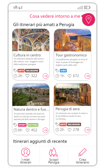
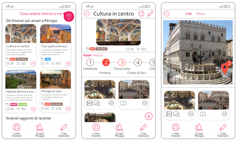
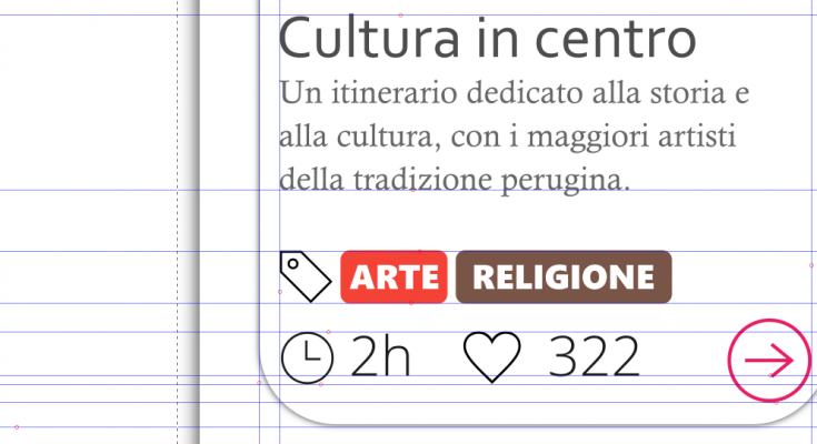
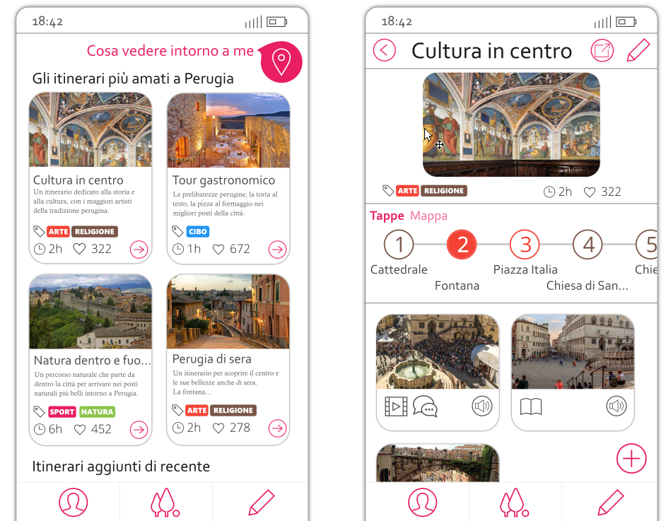
We can take the mockup above as an example. In this case, I wanted to make it clear to the user that he or she could interact with some parts of the interface, so all the elements in pink are clickable.
Furthermore, there is one clickable element that is more visible than the others: the pink marker button in the top right corner. In addition to being larger, this button has also a shadow to make it stand out.
Understanding the Use of Contrast with an Example
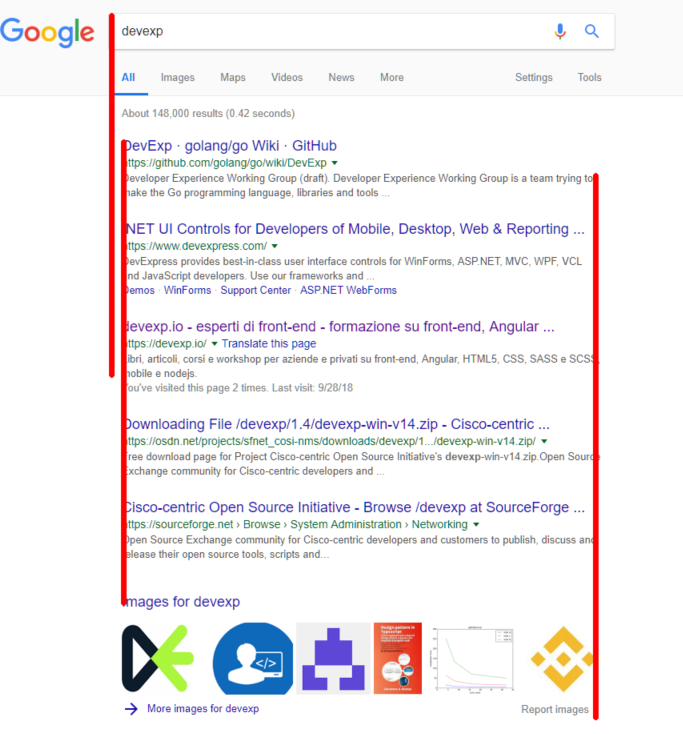
Imagine a web page without images, where the title, paragraphs, menus and other text are all in the same font, with the same size and in the same black color on a plain white background.
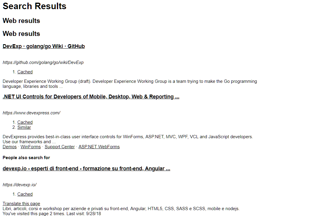
Do you recognize the page above? It's a Google search.
It's difficult to orient yourself without a minimum of number of graphics, isn't it? The first principle that allows us to improve a design is contrast.
By creating contrast between the various elements, we make structures easy to identify, for example:
-
Titles (in blue)
-
Links (in green)
-
Descriptions (in black)
Color
Color is the first tool we can use to create contrast.
Different shades of color can be used to orient the user towards certain elements rather than others: for example, we could use three shades of gray for three different text elements, giving the darkest color to the most important types of text.
Size
Another important aspect of creating contrast is the size of text and graphics.
In the example of a Google search above, to make the user place more importance on the title than the URL or the description, the size of the title is larger.
In general, a larger size allows you to place greater importance on an element.
Fonts
Font is a contrast tool that has a lot of potential.
We have already mentioned that the font size can be useful for creating contrast. When we use a font, we can also create contrast by changing other characteristics of the font, such as:
-
The font family (as we will see later)
-
The style (bold, italic, etc.)
There is much to say about fonts, and a later section is dedicated to this topic.
However, as specified below, using the right fonts also means understanding which emotions you want to convey. The purpose also needs to be considered (for example, do you want the user to read, to understand, or to pay attention?) and for this, I would rely on an expert designer to make the right choice, although you will find some hints later on.
Use of Graphics to Highlight Elements
The last technique we are going to introduce in this section concerns graphic elements that are used to highlight something.
The most common element is shadow, and for non-experts, I would recommend using very light, centered shadows with respect to the object.
Almost all mockup software has specific shading tools (in Figma, you can add a shadow using the menu on the right side).
In vector graphics software, we can create a shadow with very fine control by starting with a duplicate of particular shape and changing its transparency, black gradation and blur. We can then place it under the graphic element to create a shadow.
Below is an example using Inkscape (free on Windows, Mac and Linux).
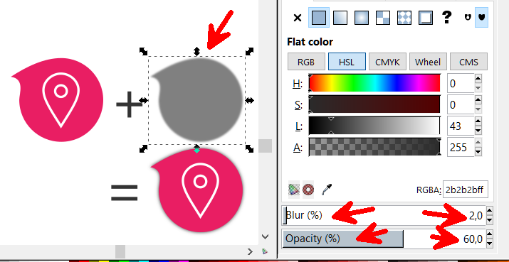
A shadow element can also be used to highlight an object more explicitly: by leaving the blur at zero and/or using a color other than black, we can create different highlighting effects.
That's all for contrast. Let's now look at repetition.
Repetition
Why
When we create a new web application, we cannot afford to use a style without rules. If we do not have a set of rules, sooner or later a page in our system will be graphically different from the others.
When semantically related elements have different graphic styles, there is a sense of clutter and noise that causes the user to lose focus.
Repetition allows us to be graphically consistent and to create a sense of relaxation for the user.
To avoid creating pages with inconsistent graphic structures, a web developer has two tools:
-
The theme of the application;
-
The components (web components).
Both of these tools will allow us to apply the CRAP technique known as repetition.
Understanding Repetition Using an Example
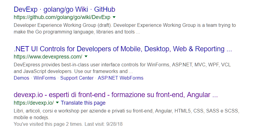
Repetition is perhaps the technique that is most similar to what developers try to achieve every day. In short, it means being consistent with the graphics. From the previous example of a Google search, we can immediately recognize the graphic style and structure of the results.
Today, this same graphic theme is used by almost all search engines, with slight variations.
Repeating a graphic structure with the same colors and the same dimensions allows us to:
-
Create order;
-
Orient the user, as he or she can recognize semantically common elements with the same graphic style.
In web development, repetition is the foundation of the frontend theme.
Repeating Colors and Dimensions: The Theme
In order to use the repetition of graphic styles for semantically related elements in a disciplined way, we need to create a theme.
The theme defines some basic rules, such as:
-
The main color
-
The secondary color
-
The tertiary color
-
The main dimension (for font, margins, spacing, etc.)
-
The secondary dimension (for font, margins, spacing, etc.)
-
The tertiary dimension (for font, margins, spacing, etc.)
-
Fonts
-
Groups of style rules to be applied in bulk (CSS classes).
For non-graphics experts, it is recommended to limit the number of colors to two and to use no more than three shades of these colors (to give more or less importance). In addition to these two colors, we could use at most five shades of gray and white (50 Shades of Gray does not apply to frontend design ;-) ).
I suggest defining three dimensions for the text: small, medium and large. For each textual element, one of these three dimensions is used, based on the importance of the text.
As frontend developers, we can ensure consistency with a theme by starting with a CSS framework such as bootstrap (https://getbootstrap.com/) or minicss (https://minicss.org/docs) and customizing the theme with our colors and dimensions.
More recently I felt in love with TailwindCSS (https://tailwindcss.com/). It enables us to use fixed-size classes for colors, sizes, shadows, backgrounds and so on. Using a CSS framework like Tailwind makes a web project more robust to graphical errors, since the choices are limited.
At https://thefrontendteam.com, we are building a complete design system using TailwindCSS. You can check the site for useful posts and I promise I will talk about design systems in another book :-)
A design system is an advanced concept that can greatly help with repetition. The blocks that form a design system are known as components. We will discuss what a component is in the next section.
Components
When applying the technique of repetition, we need to consider the organization of graphic elements into components.
In the previous example of a Google search, each individual search result can be seen as a component consisting of three parts:
-
A title
-
A URL
-
A description
This set of three elements with their colors and fonts is called a snippet. The snippet is used multiple times within the page, and allows the user to identify the structure representing a search result quickly, on the same page or on different pages.
Graphic components can be used to repeat the same structure wherever the same behavior is needed.
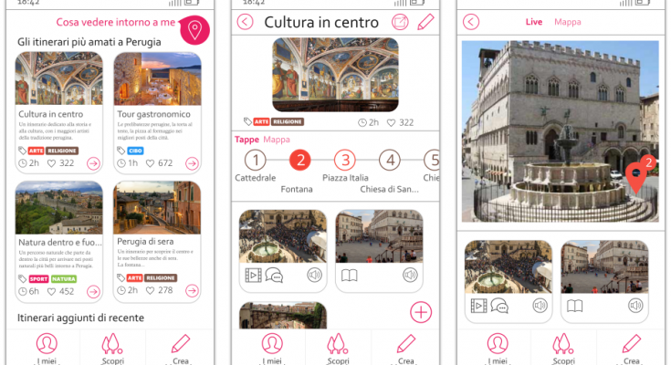
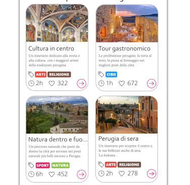
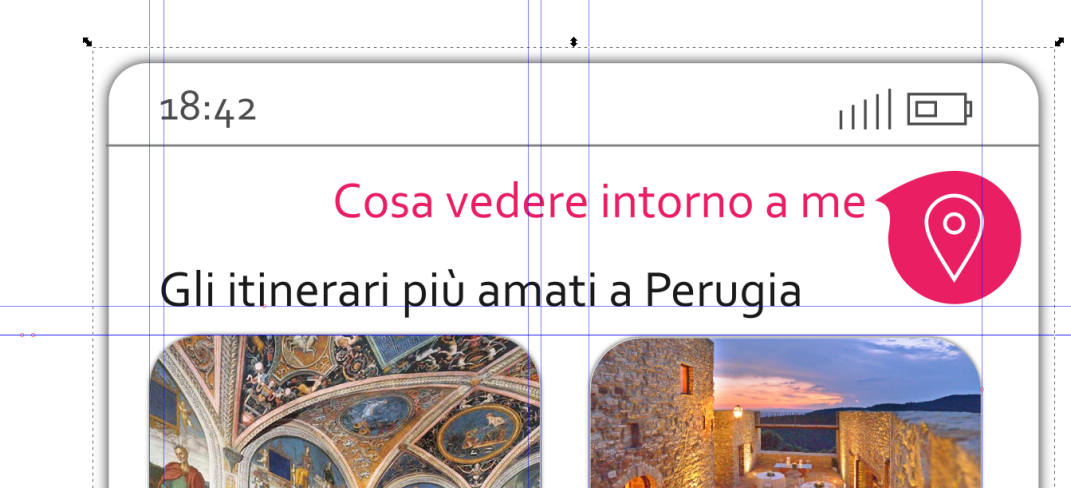
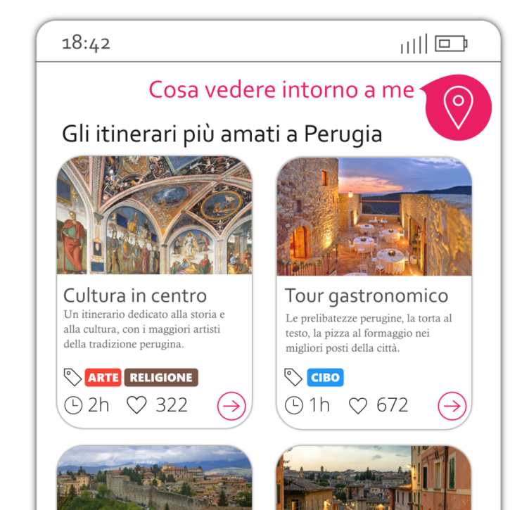
The mockup above shows an app that allows the user to browse tourist itineraries.
I have defined a graphics card that I use (by repeating it) each time I need to show a tourist route.
It is important that the tourist route is stylized with this graphic structure wherever it is shown; otherwise, the design will be inconsistent and the results will be misinterpreted by the user.
Creating Components in the Mockup
When we identify a semantic structure that will be repeated many times, we can use the grouping tool provided by the mockup software.
In general, this tool can be activated as follows:
-
Select a group of elements;
-
Right click;
-
Select Group.
Steps 2 and 3 can often be speeded up with the combination CTRL + G (CMD + G on MAC).
When I have identified and created a group, I can reuse this structure using the Duplicate tool (commonly CTRL + D) to clone the newly created group, and can then modify some internal textual or image elements to create a different copy that will still be graphically consistent.
The mockup cards in the previous image were created with this technique.
Component Development
At the development level, we can apply repetition using web components. The HTML language contains native tags such as bold (<b>) and paragraph (<p>). Web components are custom tags created by a developer, and can be used in our web projects simply by integrating some JavaScript files.
Modern development frameworks all use this concept, and allow you to create web components. Angular, Svelte, React, and Vue are perhaps the best of the current frameworks for developing a component system. Again, you can check thefrontendteam.com to find out more about web components and learn how to develop a frontend system based on components.
Alignment
Why
If you experience aesthetic uneasiness when looking at a website but cannot explain why, there is a good chance that it is an alignment problem.
A designer's eye is well trained in this regard, and can spot misalignments in an instant. However, developers sometimes overlook proper alignment---I think this is because we tend to focus on the logical functions, and do not pay attention to the aesthetic side.
It is therefore a good idea to spend a few seconds at the end of an implementation to check that we have respected all the alignments.
Alignment creates comfort and allows the user to easily organize the content and distinguish the graphics structures.
At the design level, we can (and indeed must) pay close attention to alignment when designing our interfaces. At the development level, there are several tools that can come to our aid, as we will see shortly.
Understanding Alignment Using an Example
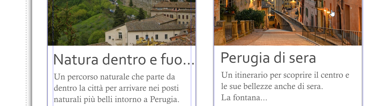
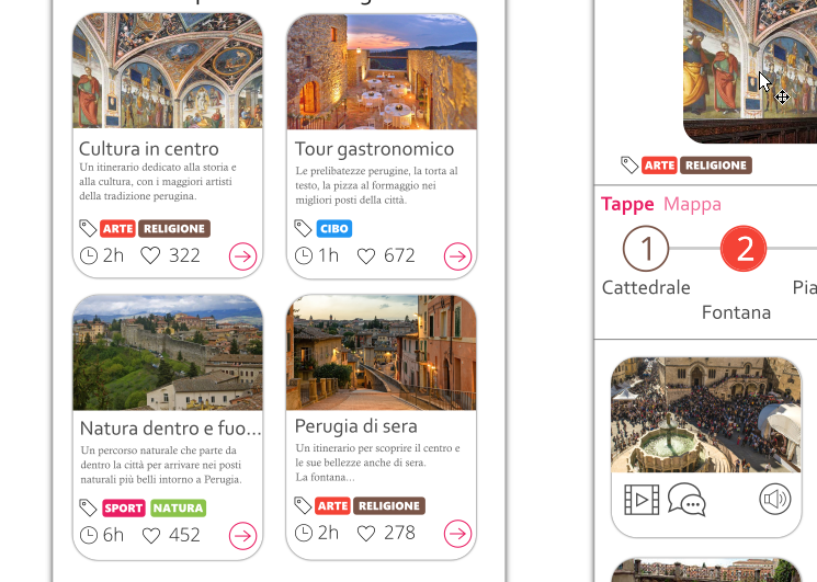
If we open the usual page of Google search results, we can see that the positions of the results respect lines to the left and to the right.
Take a look at this mockup:
It looks pretty neat. But was it all aligned by hand? Obviously not.
When designing a mockup, we can use guidelines to define the alignment of objects.
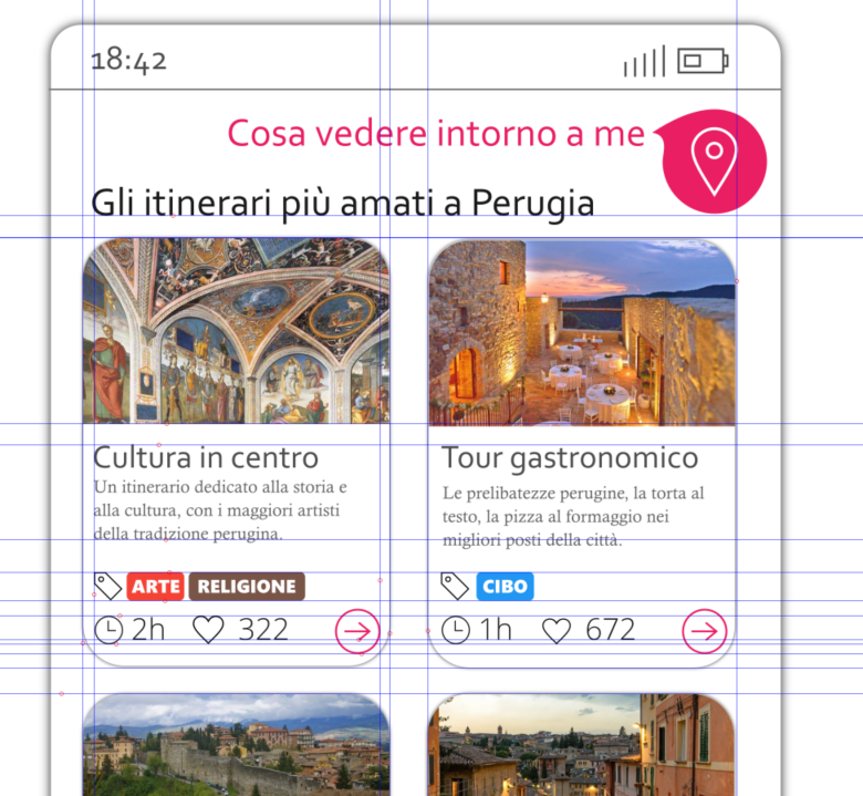
At the level of each group, a few lines may be sufficient to create order in the design:
-
At a higher level, we define page lines;
-
At a lower level, we focus on the lines for the specific component.
In a similar way to the repetition technique, it can be useful to define three or four reference dimensions for margins and spaces.
Alignment for the Web Developer
For web developers, respecting the alignment of the elements means having well-defined rules (read CSS rules ;-) ) regarding margins and padding. The padding defines the space between the edge and the internal content of an element, while the margin defines the space between the edge and the exterior of an element.
In Chrome, the developer tools include the style tab*,* which provides us with information on the margin and padding of a specific element, as shown below:
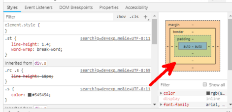
If we use a CSS framework in our projects, it is often the framework itself that provides us with CSS classes to respect the alignment of the elements that make up our page.
Bootstrap/Tailwind and Alignment
In Bootstrap and in TailwindCSS, we can manage alignment using specific classes for the margins and padding. Each class has a name that is constructed to define an alignment with a specific dimension. The logic of class names is very simple. To understand it, let's see some examples of classes:
-
.mr-1 specifies a margin-right of size 1
-
.mr-2 specifies a margin-right of size 2
-
.pr-1 specifies a padding-right of size 1
-
.pt-3 specifies a padding-top of dimension 3
The first letter indicates the margin (m) or the padding (p), the second letter represents top, bottom, left or right (t, b, l, r respectively), and the number after the dash indicates the amount of spacing (in Bootstrap, there are five levels of spacing, whereas in Tailwind there are a lot more, allowing for more flexibility).
Proximity
Why
Contrast is used to orient the user's focus, while repetition is used to create uniformity, and alignment to create order.
The last design principle we're going to introduce is called proximity. Proximity is used in conjunction with repetition to allow the user to easily and quickly identify structures. While repetition involves using the same style and the same colors for the same graphic component, proximity involves appropriately spacing different graphic components to distinguish them.
Understanding Proximity Using an Example
Let's take the Google page as our example again.
We can see from the image below how for each snippet, the spaces between the internal elements (and between the lines) are small (shown in green), while the space between two snippets (shown in yellow) is much greater: it is more than double the size.
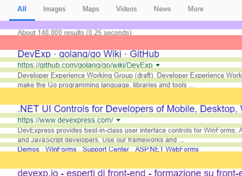
Keeping the internal elements of a given snippet close together and placing two snippets further apart helps to allow the user to distinguish between the results. The concept of proximity is based on precisely this principle: keeping elements that are part of the same structure (or graphic component) close together.
Beginning designers often think that structures must be separated using lines---but if we use suitable small and large spaces, the eye will naturally understand the pattern and recognize structures unconsciously based on this spacing.
Every time we design an atomic component (i.e., a component that has few elements inside), we will use small margins and padding; for more complex components, the spaces can be larger.
To separate completely unrelated components, we will use even larger spaces.
For frontend developers, this means designing web components by defining small internal margins and padding or using larger external margins and padding depending on how much we want elements to look closer or farther.
It is always a good idea to refer to the fixed margin and padding size CSS rules provided by our CSS framework.
Fonts and Design
In this section, we will discuss the basic techniques for designing a web project with fonts other than the default ones, and the techniques that can be used to preview them.
There are also websites that offer free fonts that can easily be embedded into a web project.
Font Types
I'll be very brief on this subject, as this discipline is actually very broad, and will just review some basic concepts here that are needed by frontend developers.
There are two types of fonts:
-
Serif
-
Sans-serif
Sans-serif fonts have plain ends to the letters, while serif fonts have small artifacts called graces at the ends, which serve to break up the space between one letter and another. These are the most frequently used fonts in writing, and make reading easier thanks to their characteristics.
How to Use Fonts
Using only one font in a graphic project is limiting, because it doesn't give enough contrast.
Since there is a need to create contrast in design, two fonts are generally used in a web project.
More than two fonts may be used, but caution should be applied, for two reasons:
-
There is a risk of going against the principle of repetition when you use lots of fonts;
-
On a web page, adding a font tends to weigh down the page.
I could provide some general rules on when to use a serif font or a sans font, but the reality is that knowing how to match fonts requires in-depth knowledge, and I would recommend leaving this to a designer. A font can convey a particular emotion, and only by mastering this subject can you choose with awareness.
However, there is a trick: as developers, we can take inspiration from combinations suggested by other designers that have already chosen a suitable combination of fonts for titles and texts. Fortunately, there are some websites that offer ready-made solutions of font pairs, and also show a preview of how the pair will look. Among these is FontPair (https://fontpair.co).
Embedding a Font
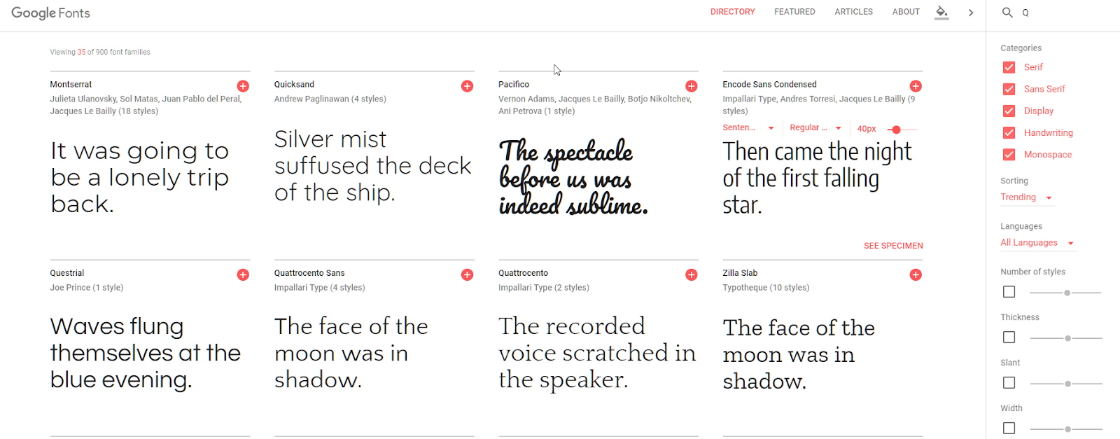
Google Fonts (https://fonts.google.com) and Adobe Fonts (https://fonts.adobe.com) are probably the best resources for finding fonts to add to a website.
Their intuitive interfaces make it possible to choose a font and to specify variants such as bold and italic styles.
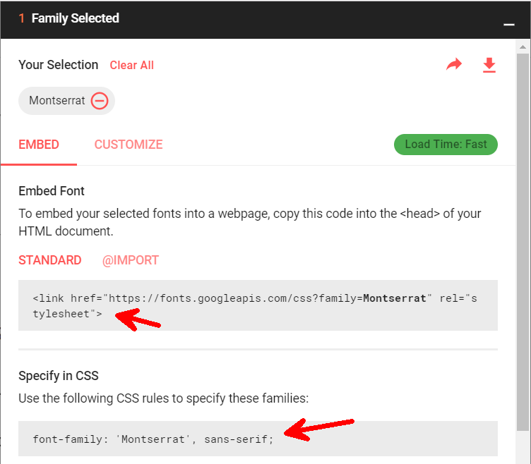
If we opt for Google Fonts, embedding a font in our web pages becomes very easy: we simply need to copy the CSS link generated by the app itself into the source code of our pages.
Remember that knowing how to embed a font is not enough, and that you should choose wisely.
Colors: Palettes, Combinations and Some Developer Tools
Colors also convey an emotional message, in a similar way to fonts.
There are two simple rules:
-
do not overdo it with too many colors, and
-
remember to create contrast.
With colors, it is also helpful to rely on a designer; however, as developers, we can try to follow some basic rules, some of which have been mentioned previously, for example:
-
Use at most two basic colors;
-
Look for contrast in the choice of these two colors;
-
For the body of the text, use a few shades of black.
You can also use color palettes (i.e., ready-made groups of colors) in a project. Of the many sites where you can find excellent palette combinations, I suggest the following:
-
For material colors: https://www.materialpalette.com/
-
To create a palette from an image: [https://www.canva.com/color-palette /]{.underline}
-
For palette ideas related to particular themes: https://www.canva.com/learn/website-color-schemes/
Before closing this short section, I would also like to point out the Color Picker that is available in Chrome for generating palettes and working with colors.
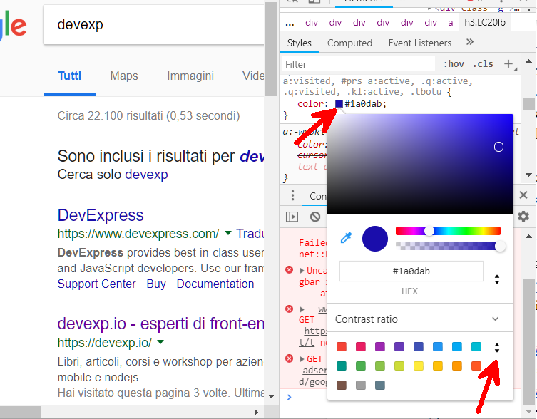
To access it, just open the Chrome Dev Tools and choose an item for which a style rule has been set. From here you can:
-
Modify the color with a picker based on the various colors of the page;
-
Modify the color using the gradient in the popup that appears;
-
Modify the color by specifying its value;
-
Change the color format (e.g., from RGB to HEX);
-
Extract a color palette of the page by clicking on the double arrow at the bottom (shown by the red arrow in the image above).
Icons: Styles, Creation Bases and the Best Sites to Find Uniform Icons
A developer often does not have the knowledge needed to develop icons from scratch. Once again, however, we can summarize some basic principles for the correct use of icons.
Below I will list some mistakes to avoid and some tips for working well with icons, even if you are not a designer.
Common tips for web developers when working with icons:
-
Don't get icons by searching for them individually on Google.
-
Unless you own a complete icon package, which was created by a designer and can be integrated with new icons in the future, I would avoid using icons that are too detailed.
-
Do not use icons with different formats and styles.
-
When in doubt, use flat icons (i.e., icons drawn using only one color). This will make it easy to customize them.
-
Use vector icons. Although it is not easy to create a package of icons from scratch while respecting the sizes of the lines and the style, we can easily use a vector software (Inkscape or Figma) to combine two different icons and obtain a third. Using a vector format such as SVG makes it even easier to combine the shapes and parts of an icon.
-
Of the available vector formats, SVG is preferred. This format can be integrated directly into a web project, and when the icons are flat, it is easy to customize the sizes and colors directly through CSS. The SVG format is also directly supported by the best mockup software such as Figma and Inkscape, and it is directly supported by the HTML protocol.
-
Try to use icons created by designers. Fortunately, flat icons are in vogue today, and there are numerous free sites where you can get high-quality icons, for example
-
Iconoir (http://iconoir.com)
-
Iconmonstr (http://iconmonstr.com)
-
FontAwesome (https://fontawesome.com)
-
Well done!
In this chapter, we have described the basic rules of design that every frontend developer must know, even those who are not designers.
By applying the techniques discussed above, you will always be able to create projects that are coherent and clean.
This does not mean replacing the role of the designer, but instead working more effectively with designers. The aim of these rules is to respect the graphic details that are sometimes not visible to the more technical eye of a programmer.
When we have mastered these techniques, we can also begin to introduce some elements of freshness and novelty, always remembering that simpler is better and it is important to respect the mental patterns of users.
If we introduce new design elements, we need to be sure that we are improving the UX; otherwise, we risk degrading the quality of the system. It is true that bold design choices create innovation, but bold things that don't work destroy the UX.
In the next chapter will talk more about what the UX is, and what a frontend developer needs to know about it.
Chapter 3: User Experience for Frontend Developers
A knowledge of the techniques and the software (e.g., Figma) needed to create a mockup is not sufficient. It is also necessary to know how to create a system that has an excellent UX and an excellent design.
If you think that a developer can (or even should) ignore this knowledge, you're wrong---a developer must know the basics of the development of each part of the application, and should always be thinking about the end user of the product.
In this chapter, we will learn the basics of UX and use a practical tool to validate the UX of a real web system.
Introduction
In the previous chapter, we saw how to create a mockup of a desktop or mobile web application and how a well-done mockup can be used to:
-
Create a faithful preview of the final application;
-
Test out ideas before development;
-
Get customer feedback before a line of code is even written.
As mentioned above, knowing the techniques and the software needed to create a mockup is not enough. A developer must know at least the basics of the development of each part of the application, keeping in mind the end user.
We will outline the basics of the UX in four brief steps, and then get to know a very powerful tool for investigating the UX of a real website, called Hotjar.
Step 1: Give Value With the UX

When designing a web application, there is a fundamental question that we must always keep in mind:
Am I giving value to the user in the fastest, easiest and most complete way possible?
If the answer to this question is YES, then we've done a good job.
The first step when designing a new application is to understand what value we are giving to our end user. If we don't provide any value, then our application has no purpose and will probably never be liked by anyone.
When the features of our application match our client's requirements by saving them time or money, then we are delivering value.
However, this is only the first essential step in creating a good UX. The next step is figuring out the best way to deliver value.
Step 2: Iteratively Create Simplicity, Speed, and Completeness

The second step is an iterative process of researching the fastest and easiest way to deliver value to the user.
In order for the speed and simplicity to be optimal, it is always important to measure:
-
The time required to deliver value;
-
The interactions required to obtain value.
The more we can reduce the time and the number of interactions required, the higher the customer satisfaction.
This process is iterative, and requires user feedback whenever possible.
A mockup is one of the most powerful tools for getting feedback quickly.
Finally, remember that the value provided to the user must also be complete, since if it is partial, we force the user to interact with the application again to obtain the remaining part of the value, which wastes time.
In the case of a web application, effectiveness is reduced every time the app is cumbersome and requires many clicks. A good book that explores these issues is 100 Things Every Designer Needs to Know About People by Susan Weinschenk.
Step 3: Fun and Aesthetics

After the previous steps have been optimized, we can evaluate the elements used to make the interaction fun and aesthetically beautiful.
If we can manage to excite a user who is interacting with our system, then the final experience will certainly be more pleasant.
In the case of a web application, exciting the user means:
-
Not introducing negative emotions arising from errors or slowness of the system;
-
Introducing positive emotions with an excellent graphic design (colors, fonts, animations, alignment);
-
Introducing positive emotions using interactions that are natural and conform to what the user expects.
Step 4: Iterative UX Process
There is no strict order for applying the previous steps; it is important to proceed iteratively and to apply what has been said above in each of the following phases of the process:
-
Analysis: Analyze the user's expectations (requirements);
-
Realization: Produce a version of the system;
-
Testing: Understand whether this version satisfies the customer's needs.
This process can be used to discover new aspects that were previously unknown or ignored, and to improve the UX by increasing our level of knowledge of the context. We can then use this new knowledge of the context to redefine existing problems and solve new or existing ones.
Verifying the UX of the Created Product
When designing a new application, our goal is to apply the previous steps to try to get the best possible results.
A mockup enables us to quickly understand whether a user will appreciate an app, to a certain extent. However, when the application is developed, it is often dissimilar from the mockup for various reasons, for example:
-
Technical limitations;
-
Higher costs than expected;
-
Time running out;
-
Developers without no basic knowledge of UX or design.
In addition, even if we did good work with the mockup, we cannot assume that the UX of the released app is optimal, and we must test our hypotheses of usability.
A developer who works in a large company will be able to interview end users and invite them to use the product in a focus group; however, for those who work in a small company or are solo developers, this path is more difficult.
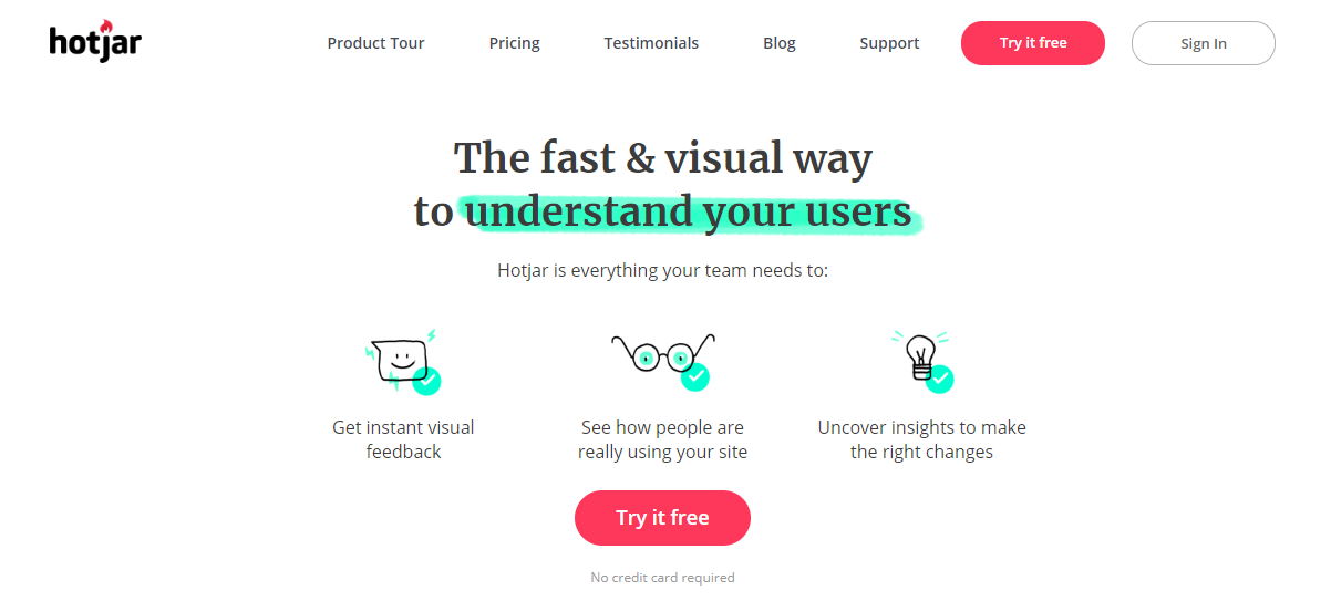
Fortunately, there is a tool that allows us to understand how a user uses our web application anonymously and transparently. It's called Hotjar, and the free version can help us to check for usability issues with any web product.
Evaluating the UX of a Web Project: User Session, Videos, and Heatmaps
In this section, we will see how to obtain information about users as they browse a web system (in an anonymous and aggregate form).
To respect our users, remember to always specify in the privacy policy that you are using these tools (this is also a form of UX).
Of all the available tools in this area, the ones I find most interesting are session videos and heatmaps.
Hotjar is a software system that provides both of these tools for free.
Installing Hotjar
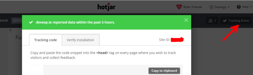
After registering for an account on Hotjar, you can copy a script to include in your web pages, in the same way as we did with Google fonts.
The final step to complete the installation is to verify that Hotjar is correctly included in each page of the site by clicking on the Tracking button in the top right corner, as shown below.
After installing the product, we just have to wait for our users to come and interact with the site. Later we can see what happened using the tools inside Hotjar as discussed below.
Use of Heatmaps to Improve Interaction
A heatmap allows us to understand which parts of the page are clicked most often by users: the more often a link is clicked, the greater the proportion of red.
For each web page, we already have an idea of the most important links. The question is: are these links also the most frequently clicked?
If not, then we have to iterate the UX, for example by:
-
Modifying the design of the links;
-
Modifying the positions of the links;
-
Modifying the text of the links.
After these modifications, we will evaluate a new heatmap.
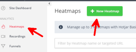
To create a heatmap, click the button at the top left corner in the heatmap section:
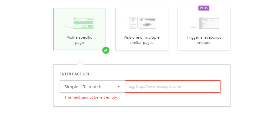
I generally create a heatmap for a specific web address (third step of the creation wizard), as shown below.
After creating a heatmap, we must wait for the first visitors before we can tell whether we have done a good job or not.
Recording Browsing Sessions
A heatmap is a static tool that aggregates the interactions of multiple users with the page. To fully understand if the site is being used in the best way and as we expected, session videos are particularly useful.
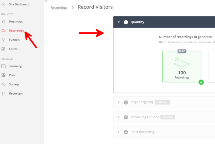
In Hotjar, a session video is called a Recording. To create one, click on the appropriate section as shown below:
At the UX level, recordings can offer a lot of information, both for desktop and for mobile apps.
For example, we can:
-
Identify errors;
-
Identify slow interaction sequences;
-
Identify complicated or unclear parts of the page;
-
Identify parts of the page that are "invisible" to the user because the design is "chameleonic".
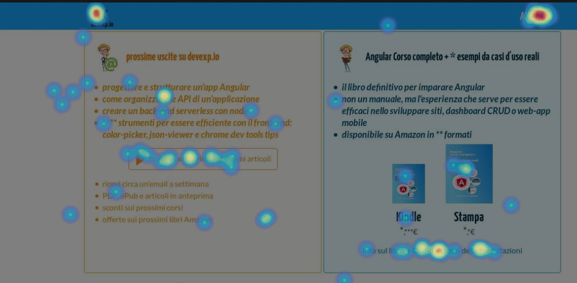
Example of a Real Use Case: Devexp.io
One of my first websites was devexp.io, which was a portal to support two of my other books---one about Angular, the other about design patterns in TypeScript (in Italian only, sorry :-) ).
This was many years ago, and I was still learning all of the relevant concepts. Today, the design is totally different, but it is still useful to see how to iterate the design of a project from its inception.
To create devexp.io, I applied the UX concepts discussed above.
The most important thing is to always listen to user feedback and iterate. At the beginning of the journey, when you still have few visitors and it is difficult to get direct feedback, you can use the Hotjar tools to evaluate user behavior on the site and, once again, iterate the design, simplifying it at each iteration.
Let's have a look at some of the improvements to the UX of the site from the first version onwards.
Feedback Iteration: Reading via PDF or ePub
A function requested by some readers was the ability to download an article as a PDF or ePub document, and I therefore introduced the option to download each article in these formats.
After introducing a new function, you need to test it and see if it actually delivers value.
This function was then evaluated through Google Analytics, and I later discovered that in fact, few users preferred these formats over the web page. The reasons for this may vary, but the result is that having all those buttons may be confusing, so I removed this feature. Less is more, especially when more is not useful to anyone.
Top Menu

In the first version, the design was very simple and there were several links that were not intuitive. From the heatmap, I noticed that some links were often clicked, and especially the Angular one.
In the first version, there was an image slider on the page that scrolled between an Angular image and another image every two seconds.
When the Angular link was clicked, the slider moved and remained fixed on the Angular image. Of course, when the slider was already in the Angular section, clicking the link did nothing, because the user was already in the Angular section.
When the registration sessions show that many users clicked a link several times and nothing happened, you understand that something is wrong. In this case, the impression was that the link was broken!
The Angular link was therefore changed to point to a new page giving information on the textbook, since the user's intention was probably to deepen their understanding of the Angular concepts.
In the sessions recorded following the modification, users who clicked on the link did not go back immediately (no bounce), a sign that they had actually found what they were looking for.
Registration on Exit
Many readers read an article without being registered, and I therefore considered introducing a registration popup when you leave the page.
Using the recording tool, I noticed that many readers saw the popup and closed it before closing the article tab. For unregistered readers following devexp via LinkedIn, seeing the popup each time is just a nuisance.
The solution was to show the popup to returning visitors only the first time, without bothering them further.
Well done!
We have seen how we can greatly improve the UX with a few simple concepts.
More generally, whether we are developing a tool with a GUI, a library, or a non-software system, we should always think about the end user. We should try to simplify it and improve the experience as much as possible.
In the case of a graphical interface, we can improve the UX in the mockup phase, but we will still have to test the usability of the finished product.
Hotjar is a tool that helps us to do this in a way that is simple and free, by monitoring the sessions of a user.
This tool can be used to improve the experience of future users by:
-
Making assumptions;
-
Implementing solutions;
-
Verifying whether the implemented results led to improvements over the previous version.
I believe that learning the basics of UX and design makes for better frontend developers.
Even if you are not a designer, you now know the basics of making aesthetically pleasing products. The next time a designer talks to you, you will be better able to understand the goals of the project.
Since you know how some parts will be implemented, and the limits and the possibilities, you can even give suggestions (although always with respect for their work and their way of seeing the world).
Now let's put all this theory into practice, by creating the mockup of a landing page.
Chapter 4: How to create the mockup of a landing page step-by-step
It's finally time to put everything into practice.
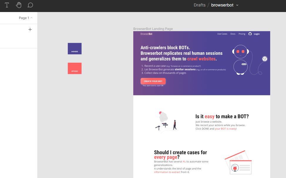
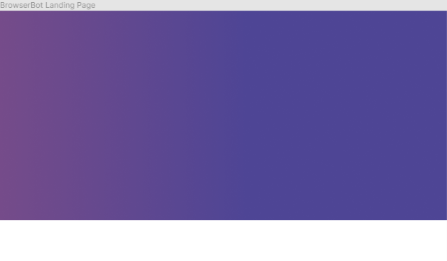
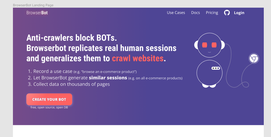
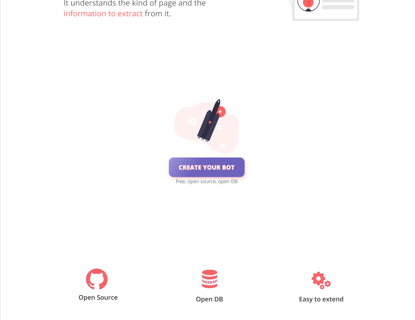
In this chapter, we are going to create the mockup of a landing page: browserbot.io.
browserbot.io is a generic system for replicating and generalizing web sessions of real users to:
-
Test websites like humans do,
-
Crawl websites,
-
Verify pages,
-
Generate information pages by extracting parts of other pages.
You will start from the UX. For a landing page it means designing the user experience of the texts.
Then you will create the mockup in Figma by applying the rules seen so far.
This will be the result:
Let's begin.
How to design the texts for an effective landing page: Information UX for an LP
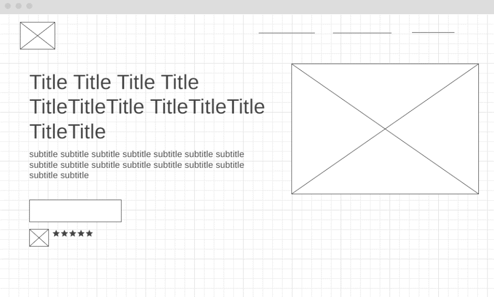
An effective pattern for organizing the information of a landing page is as follows:
-
Title
-
Subtitle
-
Image
-
CTA + Small Social proof
-
Features
-
Pricing
-
FAQs
-
CTA
-
Social Proofs and/or Personal notes
Title

What does the user expect from the title?
You should describe what the product does in a synthetic way.
But the user will immediately think of an objection.
We should answer the most obvious objection and why our target should choose us rather than others: why do we provide value? And how do we provide it better than the competition?
Sometimes the objection is obvious, especially if you know your target market.
In the case of browserbot, the main objection is not immediately obvious.
In this case, we can make a hypothesis and bet everything on the most probable one. We can change it later.
The main use case of browserbot is definitely crawling: the extraction of information from websites.
The main problem with crawling is the use of anti-crawling systems. They identify whether who browses the page is a bot or a real person: the anti-crawler blocks the bots by canceling the page navigation.
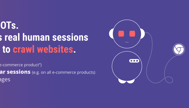
Browserbot simulates sessions recorded by real people, and so it bypasses anti-crawlers.
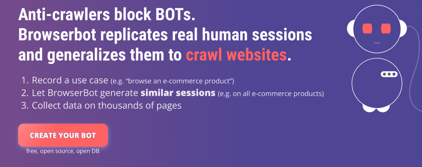
The title could then be:
Anti-crawlers block BOTs. Browserbot replicates real human sessions and generalizes them to crawl websites.
The sentence above is informative, because it explains what the service does, and responds to the most likely objection.
Subtitle
For the subtitle, once again we take up the main goal of UX: giving value quickly.
In the subtitle, we must describe how we will give value:
-
by solving a problem in a new and more effective way?
-
with some technique, tool, or methodology?
-
by saving money or time with tools or techniques?
In the case of browserbot, the how is very simple: you install a chrome extension and register a web session. The system then takes care of everything else.
Install the browserbot Chrome extension and start recording use cases on any website. The BrowserBot AI will then start to collect data for your sessions and for similar generated sessions for all the pages on the same website.
Written like this, however, it is a bit long. Is there a more effective way?
Bullets

I believe that bullets are a technique that reduces the cognitive load, allowing the user to break many concepts visually. I then tried to rewrite the above subtitle using bullets:
-
Record a use case (e.g. "browse an e-commerce product")
-
Let BrowserBot generate similar sessions (e.g. on all e-commerce products)
-
Collect data on thousands of pages
Easier to read, easier to understand.
Visual
Here we can keep it simple: a screenshot of the tool in action is enough. If the app is not ready, we can of course take a screenshot of a mockup.
And if the service doesn't provide a tool, we can provide an image describing the value we will provide.
For browserbot, we do not have a product yet and neither the mockup.
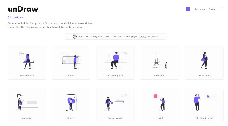
I decided to edit an illustration from undraw.co (where you can have SVG illustrations for free, customizing the main color).
It was easy to edit the illustration directly in Figma, as we'll see later.
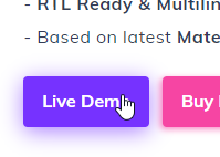
Call-to-action or CTA
For the CTA let's remember what we said in the UX chapter: we must highlight the value.
For browserbot it could be:
Create your browser bot
The user will have an objection for the CTA too, so we can imagine what it is and anticipate the answer.
Alternatively, we can suggest some key highlights to empower the CTA.
For browserbot I choose to add the key points of the tool:
free, open-source and open DB
At the UX level, we have to make sure that the CTA allows the user to go to the next step very fast, without any friction.
As far as possible, we should only ask for the email and postpone everything else until later. And if that's not possible... let's make it possible.
Immediately under the CTA, we need to add some social proof. At the beginning we may not have many social proofs, but adding some users' comments is fine too.
Adding social proofs can be an iterative process, so as soon as we have better ones, we will update them.
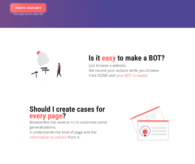
Features (the 3 main ones) and FAQs
Here we must describe what the product does, but answer possible objections:
-
is it easy to create a BOT?
-
do I have to create a bot for each page of the site to manage?
For the FAQs, I will not dwell much: these are questions and answers that clarify everything that has not been clarified before. Even on vertical topics, such as price, credit cards usage, privacy, etc.
Build a Landing Page in Figma: How to Create a Mockup
How To Choose The Colors and The Theme
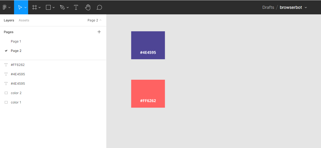
Before starting with the mockup, we are going to choose the colors of our landing page.
Color is an important element to present our product. Tones of red or orange are suitable for some products, less so for others. Blue is very good for tech products, green for green products.
For browserbot I have chosen two main colors:
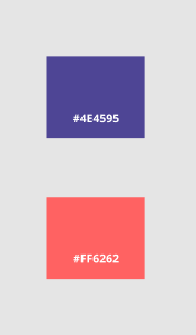
Why? If you look for images on topics about BOTs, artificial intelligence, and crawling, you will find these colors appear a lot.
Before choosing colors, you can also refer to the "Getting Inspiration for Our Mockup" section below. After looking at some other apps, you may choose similar color combinations from other designs.
How To Choose The Font
For the fonts, the fontpair site provides some interesting pairs.
Again, looking for some inspirational landing page template themes in our context, usually we can see the live version and look for the fonts used for the title and for the texts.
I use the Chrome Devtool for this purpose and the Inspect panel in particular.
Look for the Computed Styles section, then for the Font Family property:
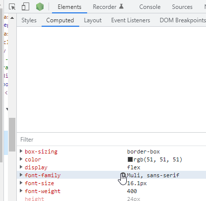
For browserbot I chose the following fonts:
-
Roboto Condensed for the titles
-
Open Sans Regular for the texts
How to decide on the Desktop and mobile basic structures
To make the mockup, we will proceed with a structure that is widely used.
It is simple to understand and build.
This structure has three characteristics:
-
header at the top with logo on the left and menu with links on the right,
-
the upper section about ¾ of the page with title and subtitle on the left, the image on the right
-
immediately below the subtitle, with an important margin, the CTA
This structure also fits well on mobile: the only tricks are:
-
the image goes after or before the title,
-
it is reduced in size so that the title remains immediately visible as soon as the page is loaded.
In some cases, on mobile, we can also eliminate it, but when in doubt, I do not recommend it.
Getting Inspiration for Our Mockup
Before starting the mockup, be inspired by the real experts.
Let's go look for some landing page templates of products that may be related to ours in some way.
My favorite sites when I try to get inspired are always dribbbles and ThemeForest.
Once we have found inspiration, let's start with our mockup.
Start Building the Mockup of a Landing Page
Landing Page Reference Colors
Before even starting, I create two rectangles with the main colors, to always have them available for reference.
And immediately after that, I create a frame the size of the desktop.
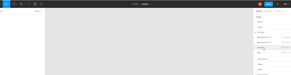
For browserbot I assume that my visitors will come mainly from the desktop, but if you assume that they will come from mobile, then you could start with a mobile frame.
Landing Page Background colors
The background color of the page will be white.
To give contrast to the main part of the landing page I use a background of a different color than white:
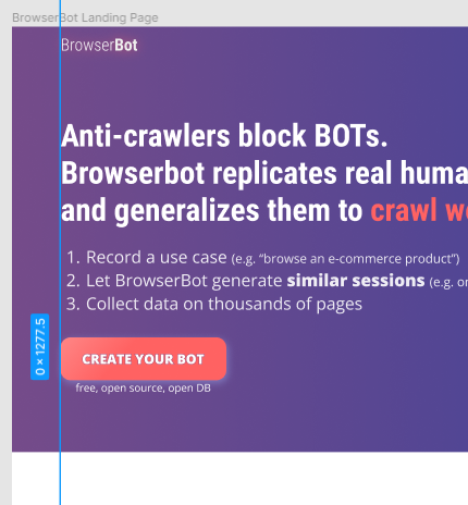
Landing Page Title
Then let's add the Title, respecting the structure above:
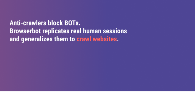
The color of the Title is white, to contrast the background. Only two words use the secondary color, to emphasize them using a color contrast.
The alignment is on the left: in general, a left alignment is preferable to the centered one. When undecided, go for a left/right alignment, especially when the text section is not centered into the page.
Landing Page Subtitle
Let's move on to the Subtitle, which in our case are bullets:
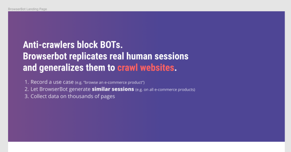
Notice how I only used the white color. But this time I used the typography to contrast certain parts over others:
-
A smaller font, for the examples
-
A bold font to highlight some text.
Note also the use of proximity: the subtitle is close to the main title.
Landing Page Visual
For the Visual part, I went to undraw.co and set the color using the color tool on the top right corner of the page.
I choose the secondary color because the position of the image will be over the primary color.
To find a good image, I searched for "AI":
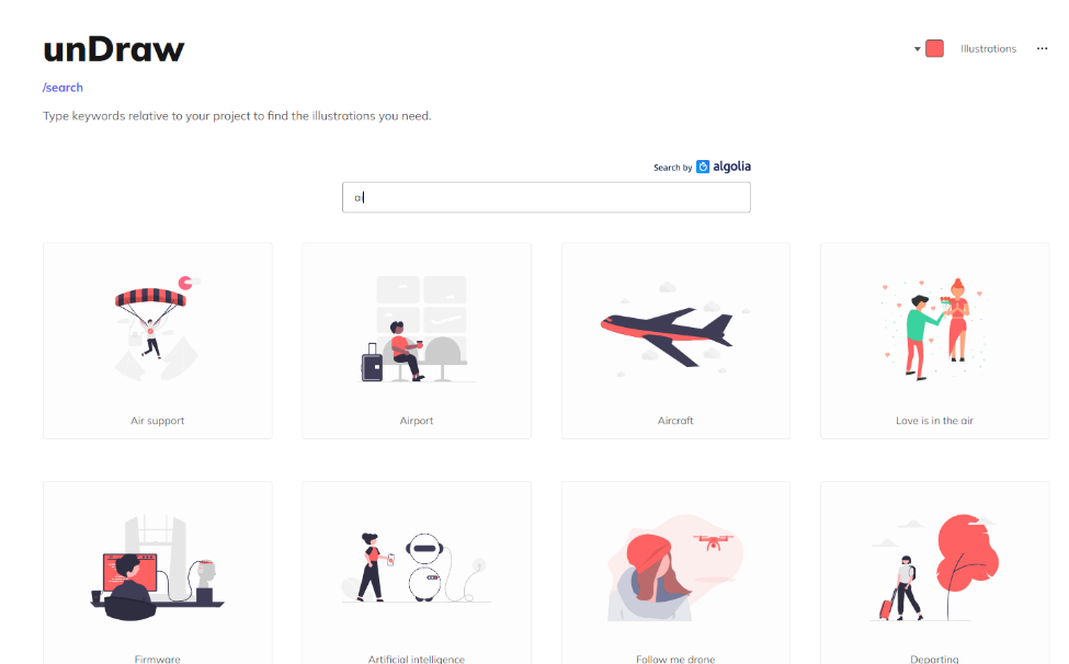
I liked the image of the bot (the second of the second row), but I slightly customized it as below, directly in Figma:
It recalls the BOT in the browserbot name.
For the chrome icon, I took it from iconmonstr.com and added it to the top right corner of the image.
I then made some small further changes; most of them were removing unnecessary parts.
Let's now move on to the CTA.
How To Design The Call-To-Action (CTA)
The CTA needs to be in strong contrast to the background and other elements, so I'll use a colored drop shadow.
I used uppercase text, with a slight border and a gradient background based on the secondary color.
The button has a halo too, obtained with the shading effect of Figma:
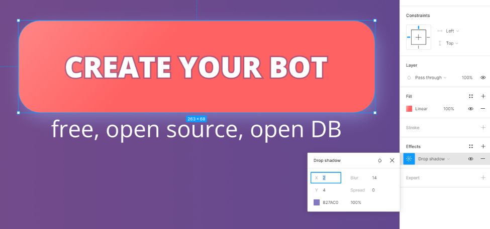
The halo, the gradient background, and the text border will again give a high contrast to the button in the page.
Landing Page Header
Let's add the header part that includes the logo (to the left) and the menu (to the right).
I kept it simple: the logo is just a text, with some contrast: light font for the word "browser", bold typography for the word "bot". It is a quick way to generate a simple logo when you have other priorities.
Landing Page Alignment and Proximity
About the alignments, there are two main lines in this mockup. One on the left
And one at the top to center the elements of the header:
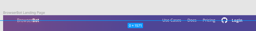
Notice in the header how links are close one another, while the logo is far from them.
There is a big space between the header and the title, while the subtitle is close to the title.
Proximity allows us to create separate sections.
Landing Page Secondary Sections
Before adding the secondary sections after the main message, I gave quite a bit of blank space.
The space gives breath to the various elements and allow the user to identify the sections effortlessly. Proximity makes the sections even clearer.
Regarding the icons at the bottom of the image above, they were taken from iconmonstr with a simple copy/paste of the code (using the embed button).
A border was added in Figma using the primary color.
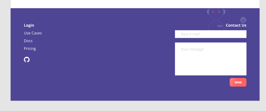
Landing Page Footer
Let's quickly describe the footer:
-
right alignment for the contact part
-
left alignment for the links
-
and a small transparent background of the BOT, otherwise it all seemed too anonymous.
For the background, notice that I have taken the same image of the bot above, but the icon is now that of the contact center.
This is a nice example of repetition, which I could also exploit in other contexts: same image of the bot, different icon.
Here ends our mockup of the browserbot.io landing page
I know that during the implementation I will change several things, but for now, it can be enough to give an idea of the project to the stakeholders and possibly iterate to a new version.
The mockup can be reached at this link:
https://www.figma.com/file/g0TEztcF9n7s7kcfY2oOLb/browserbot?node-id=0%3A1
If you want you can follow the progress by browserbot.io by subscribing to thefrontendteam.com newsletter.
Conclusions and What's Next
I hope you enjoyed reading this short book as much as I enjoyed writing it.
If you want to keep in touch, have a look at https://thefrontendteam.com or connect with me on LinkedIn at https://linkedin.com/in/salvatoreromeo.
I always love to talk about the frontend :-)
In this book we got a basic understanding of the main design and UX rules. And knowing how to apply these techniques allows us to have a complete overview of the project.
The idea is to always provide the frontend developer with new tools and knowledge to be more effective and optimize the work within our team.
In fact, at thefrontendteam.com we are developing a tool to further improve the communication between designers and developers: the design system.
You will already find some articles on the site and soon a new book will be published online. It will complete this path:
Design Systems for frontend developers, the definitive guide
It will talk about what a design system is, what are the advantages of using it and how to implement a design system.
You will also see how the frontend team has already implemented the design system of the ButOpen projects, published as an open-source library at:
https://github.com/butopen/butopen-design-system
(Work in progress, open-source)
Once again, if you want to stay updated and follow the progress of our frontend work, follow us at thefrontendteam.com
And if you really liked the text, let us know by posting a review on Amazon. it is useful for advertising the work we are doing.
Thank you. And see you again at thefrontendteam.com.
That's all for now, but join our newsletter for more stories (Join us at the bottom of the page).Thank you
❤️ The Frontend Team
Did you like this story from the frontend team?
Share with the community
👉 Share on twitter
👉 Share on linkedin
Join our community 🙌
Join us and get:
-
 Design, UX, and Mockups for frontend developers - The Definitive Guide for $14,99 free, instantly
 - a 30-min slot to discuss about frontend problems, architectures, ideas
Find out how the frontend team enjoys developing software.
At The Frontend Team we write about what a frontend team faces everyday: development, design, UX, DX, devtools, people, process.
If you want more stories, subscribe below.
Subscribe only if you want to receive content about frontend
development, design, devtools,
UX,
DX,
team, tests, and sometimes backend (for frontend goals only, promise 😉).
You can unsubscribe in any moment using the link at the end of each email.
❤️ The Frontend Team